ShopDreamUp AI ArtDreamUp
Deviation Actions


Description
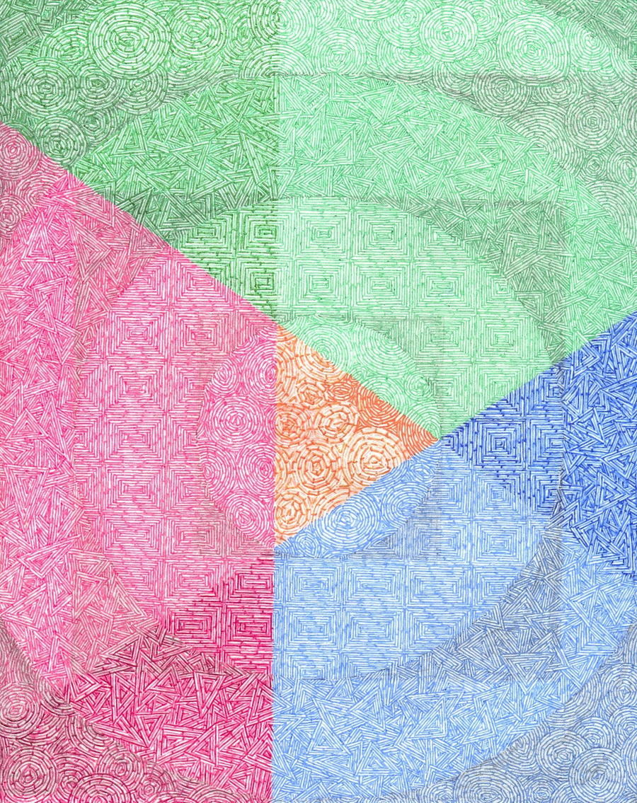
Another day, another drawing. This one came together in record time, just under 20 days; I have been experimenting with darkening the paper using pencils before drawing over them with ink. I have also begun experimenting with mixing ink shades. Let me know what you think. Please fullview it, as the thumbnails don't do it justice.
Image size
1584x1996px 2.45 MB
Make
HP
Model
HP ojp7500
© 2012 - 2024 Promethicon
Comments7
Join the community to add your comment. Already a deviant? Log In
This is really sick man. The transitions from shape to shape seem so abrupt when you look directly at them, yet they flow perfectly and you can't even tell there is a transition when you aren't looking directly at the seams, which is incredibly given the dynamic changes. The darkening borders seem to give two different interesting effect. The first, I get when I'm looking at it from afar. It seems as though, when you can't make out the details, it's a paradox with a circle border within a circle border within a circle border, with similar intricate patterns within each. As you get closer, it becomes more clear the patterns vary, and that really makes it more captivating. The second effect I found is actually quite sick, and it may just be me. When zoomed in all the way and not focusing on anything in particular, these dark areas seem to disappear and instead I get the impression of a pulse. I think this is due to the change in shade on the subtle transition of shapes, but it seems like the piece is gradually pulsing outward from the center. It's an incredible illusion, really.
I love the different shades you've achieved within each colour section, and the details in the more contrasting areas are really crisp. That said, I think the green area could use some darker shades. It just seems slightly less contrasting than its blue and pink counter-parts. Also, I think the orange circles could use a bit more definition. I think I understand the effect you were going for, but I think the orange circles are slightly too fat (featuring like half the layers of those surrounding) and could use some more mid-tones and less highlights.
This is truly breathtaking, original, and of course, trippy. Fantastic work. Keep unique.